Creating Unique Spaces inside a Square-sized Canvas
Creative Member DESIGNチーム
Hello, it's me again Y from the design team.
To be frankly honest, I'm having a hard time thinking about topics to share in this blog...lol
This time, I have decided that I'm going to talk about the first lesson I've had for my design class in
university,and that is the ultimate practice of placing 5 different sizes of circles and lines in their
respective square canvases. It might sound easy at first, but it really takes a toll on you when you're
trying to figure out the perfect solution for the task.
This is especially hard when you're doing this with a square and not a rectangle, since square has the
same height and width, which means the shape itself only has similar spaces in between its edges.
Even now, I couldn't guarantee that I can create the best answer for it...
However I believe that it is a practice worth revisiting from time to time.
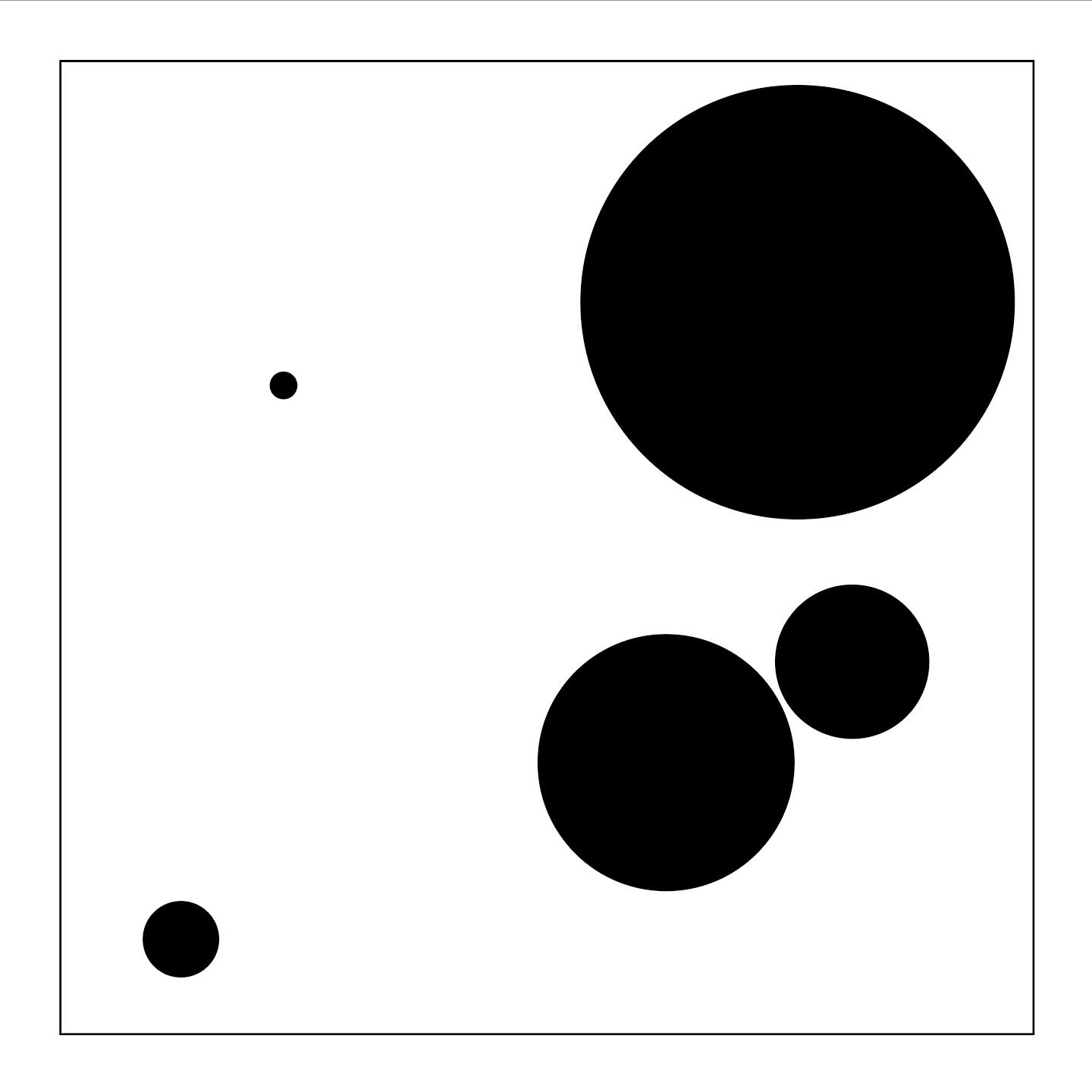
As a revision for myself, I tried recreating the exercise and it looks something like this.

Just by looking at it, you're probably thinking
" What am I looking at here? It's just circles and nothing more."
Well, that's the whole point of this exercise I suppose...trying to maximize the potential of a design
with nothing much going on by utilizing the sizes of the circles and the interspaces between one
another.
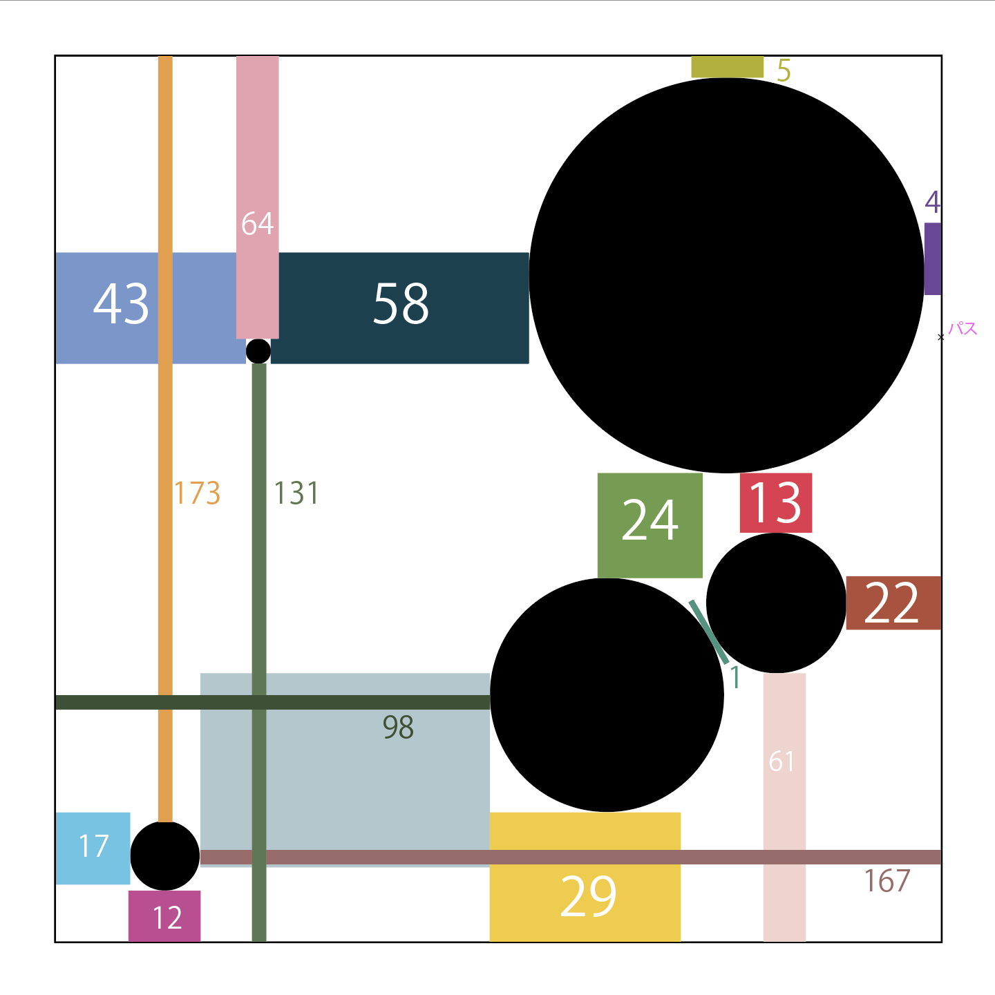
You would want to avoid creating spaces which are too similar to one another, since it would make
the whole image looks repetitive in a way.
Besides that, you may also want to be prevent the circles' positions from aligning accordingly to
their sizes as well. This is because this may cause the whole image to look too predictable and the
main goal of this exercise is to make the dull image look as unique as possible.

Based on the following above, I think I manage to check everything on the list except for the largest
circle's space between the sides, which are 4mm and 5mm respectively.
I hope you get the point after the explanation above. If you're interested, you could easily try this
with any medium you could possibly find. My first time doing this was on paper and it was definitely
harder than using Illustrator.
Therefore, I really encourage you all to try it!
That's all for today and thank you if you're reading till the end of this blog.